

Tipping Point: Artist Responses to AI
A collection of immersive artworks and displays that are a true experience of calm in today’s AI driven landscape. The collection is commissioned by BRAID UK in partnership with inspace and funded by….
The Brief
Essentially, we would like you to come up with a concept ‘brand’ for the exhibition as a whole which would then filter into the individual interpretation elements for the space plus the general publicity graphics for Inspace/building.
The look and feel should lean into BRAID values (trustworthy, responsible, open-hearted, authentic, professional, community-minded, inclusive, clear, creative etc) but could lean hard into into the playful/creative space. Could be done by lifting the tone of the BRAID palette for example.
Exhibition/Interpretation Artwork required:
- 1 x Exhibition title – cut out letters
- 1 x Introduction text panel
- 1 x Acknowledgement Panel – text + logos
- 7 x artist/exhibit panels approx 400mmx 400mm
Inspace/Building Artwork required:
- 2 x cut vinyl for glass entrance doors (one to be Inspace logo)
- 1 x Exhibition Title – concrete wall (exterior, entrance)
- 1 x Exhibition Title plus directional arrows – – concrete wall (exterior rear wall)
- 1 x Exhibition Title plus tag line, arrows, dates, free – for glass window
- 8 x (diff artwork – using artist images) round approx 400mm dia pavement vinyl
Exhibition/Interpretation Artwork required: Authenticity Unmasked
- 1 x Introduction text panel
- 3 x artist/exhibit panels approx 400mmx 400mm
Better Images
Is a useful free resource to explore for visual representation AI.
- “Abstract, futuristic or science-fiction-inspired images of AI hinder the understanding of the technology’s already significant societal and environmental impacts.
- Images relating machine intelligence to human intelligence set unrealistic expectations and misstate the capabilities of AI.
- Images representing AI as sentient robots mask the accountability of the humans actually developing the technology, and can suggest the presence of robots where there are none.
- Such images potentially sow fear, and research shows they can be laden with historical assumptions about gender, ethnicity and religion.
- However, finding alternatives can be difficult! That’s why we, a non-profit collaboration, are researching, creating, curating and providing Better Images of AI.”
The Approach
Starting the creative work always begins, for me, with writing key words from the brief and expanding my thoughts. In this case I jotted down groups of words that directed my thinking for the the design concept.
- Explore, Experience, Discovery
- Challenge, Opportunity
- Hesitate, Obstacles, Distance
- Landscape, Terrain, Wayfinding
- Navigate, Journey
A low budget project doesn’t mean that creativity can’t be explored and I find words help me to focus.
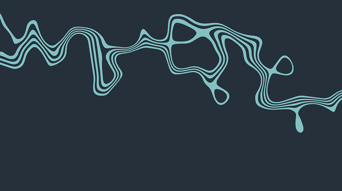
I wanted to give the commissioned artists credit by identifying a strong visual that could reflect all their work with an overall identity.
From the words, I sketch out visuals that come to mind. Most I reject and that’s part of the process. It’s important to explore shapes and simplifying visuals as they flow.
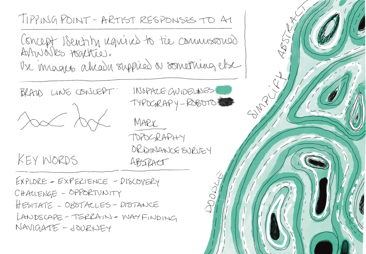
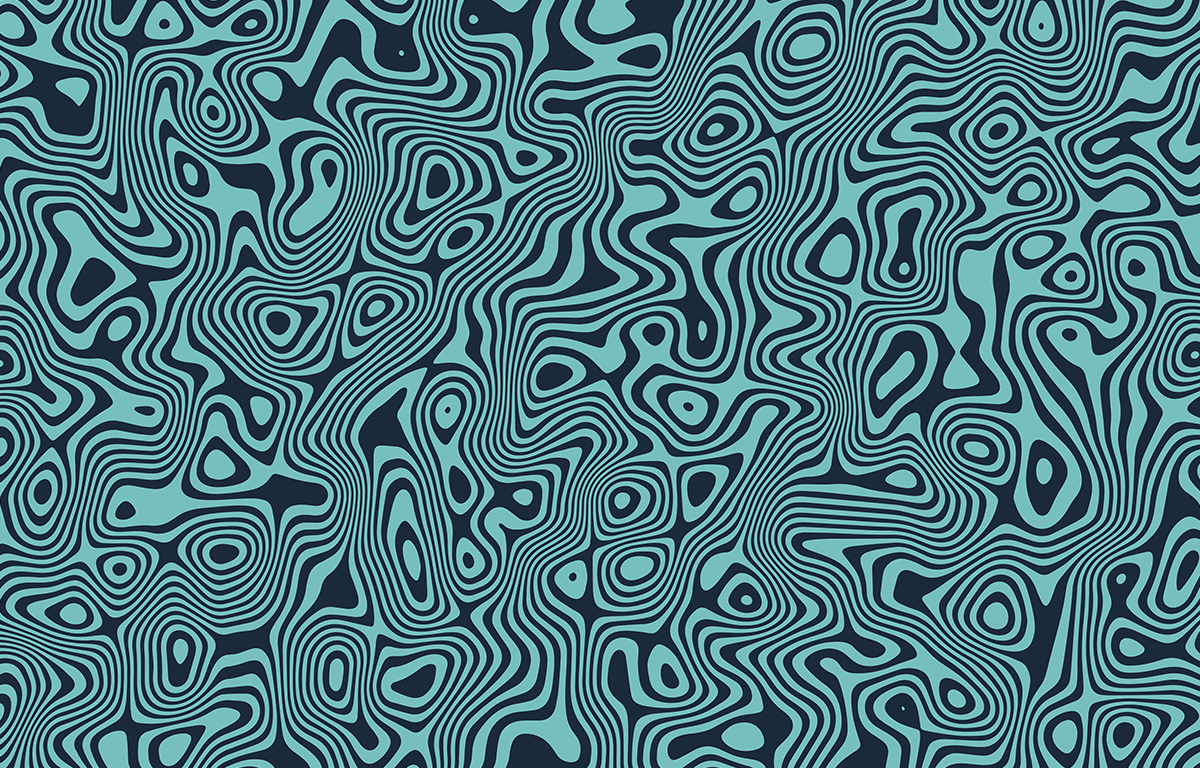
Solution
If a budget allows, I’ll aim to create artwork from scratch. In this case I looked for stock vectors and came across a topography illustration on envato elements that fitted my concept perfectly.
Often this isn’t the case and I need to adapt and edit stock vectors I’ve licensed for a project.
With this illustration I could take sections and make them flow with the typography to create an identity.
The Big Picture
In creating an exhibition identity, you need to look at the bigger picture and consider the following,
- Where will the identity be used
- Production and materials.
- Ensure all assets are consistent visually everywhere
- If appearing small, where and exactly how small?
- Same for large format – where and how big?
In short will all the final assets across social media, website and vinyls scale consistently?
You can read more about the final ‘Tipping Point: Artist responses to AI’ design project in my portfolio.