
As a child, I spent hours in solitude working out how something could be made. I loved drawing and making books – sewing and making up patterns. It never occurred to me that I shouldn’t try out new things and experiment.
It’s true that age creeps upon us, yet I have no intention of stopping my curiosity, learning and being brave. I’ve discovered over the last year that I’m still my younger curious self. Still hungry for a challenge.
Two years ago, I wanted to explore oils again. I had a deep desire to remove myself from self doubt, judgement, attention to the details and let my intuition guide me in my painting. I wanted to make this exploration by painting freely and intuitively. My curiousity began with a creating a collection of square 5×5″ abstracts in oils.
I regularly explore and record the colour palette of random objects and nature. It’s integral to my work so the idea of an abstract collection was born with a self structured brief.
A Season in Stillness
I still think this looks like silliness at first glance and I’m fighting the urge to change it to ‘A Season of Hush’ but here we are.
A sensory collection of twenty small oil paintings inspired by the scents, textures and quiet beauty of the season.
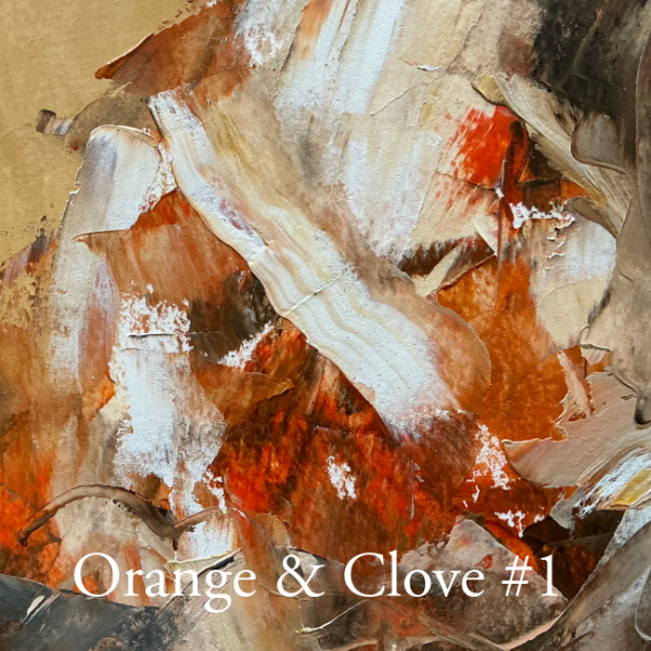
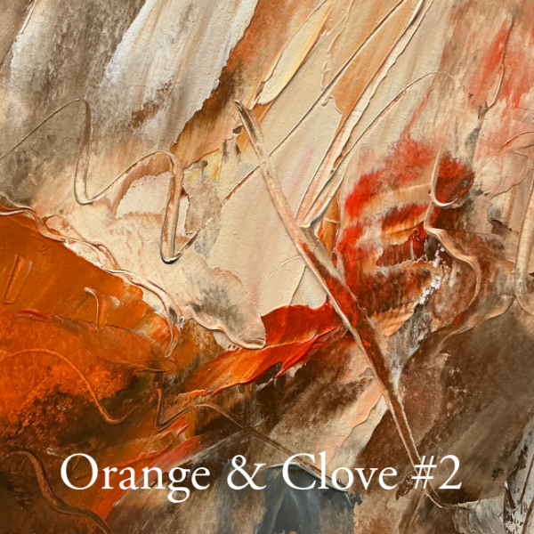
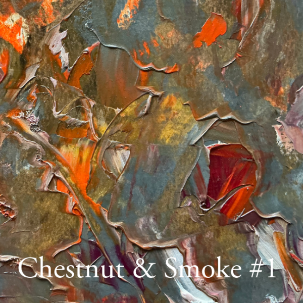
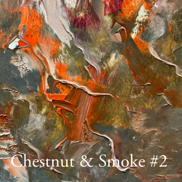
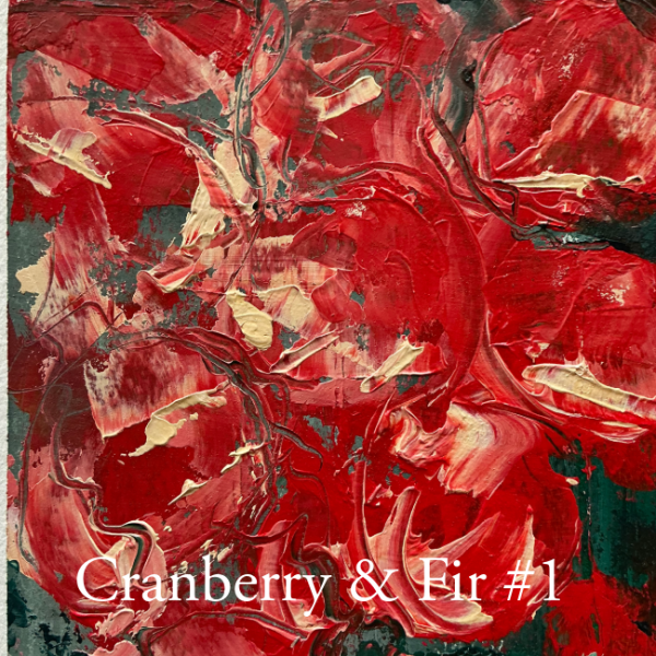
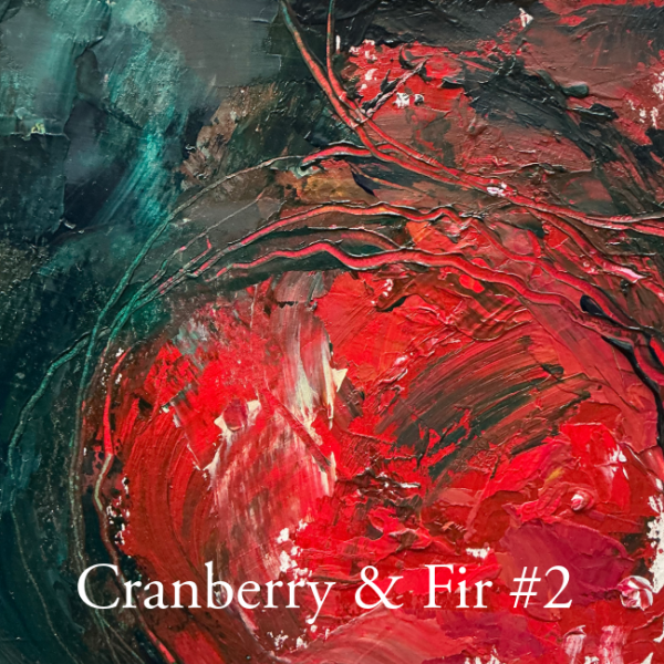
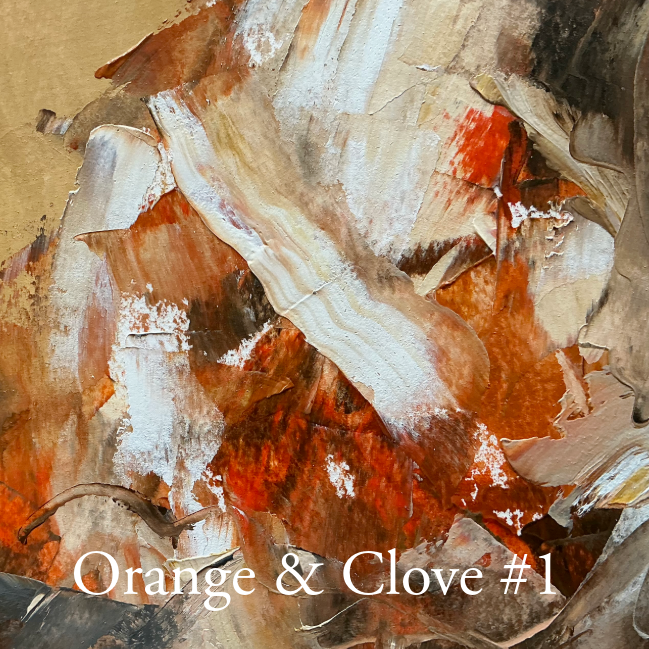
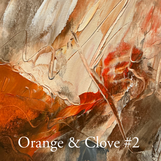
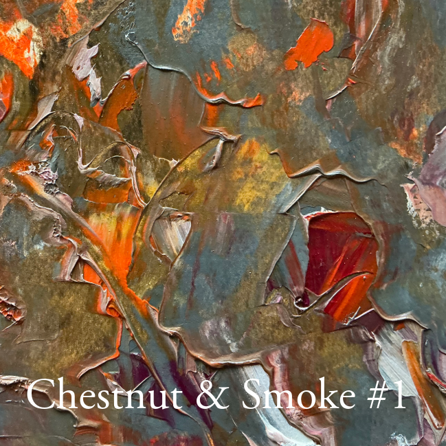
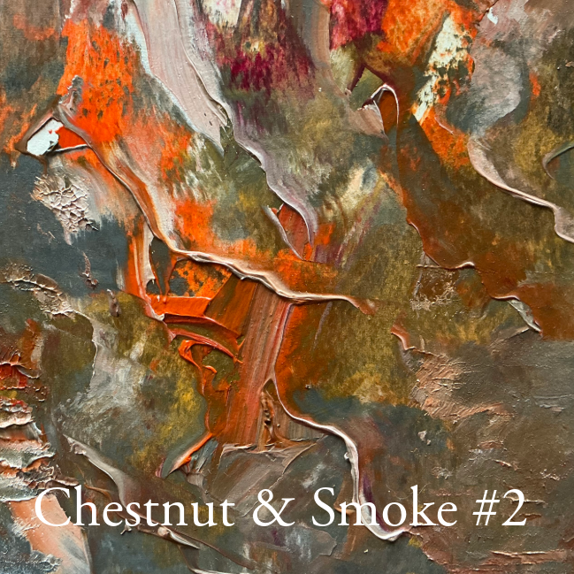
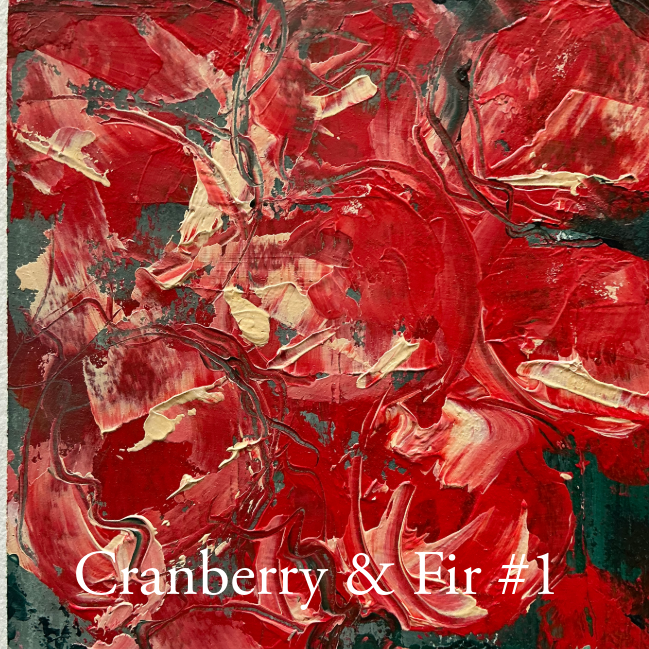
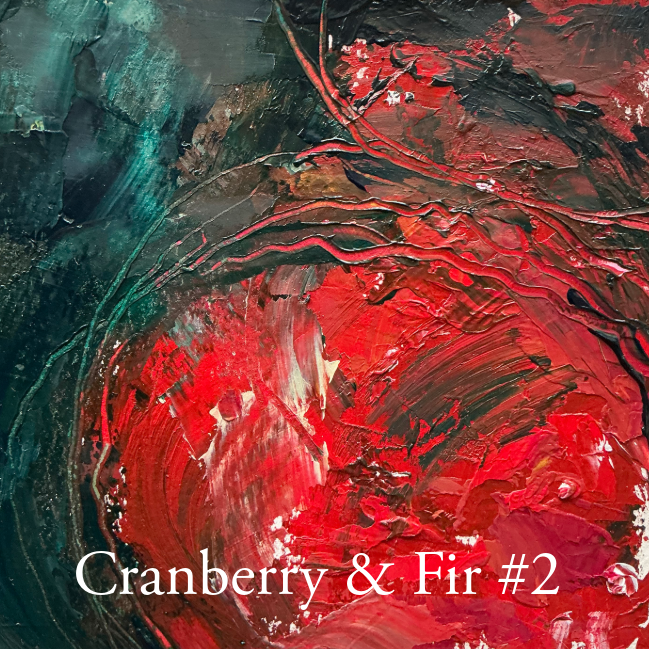
This collection of 20 5×5” oil abstract paintings aims to capture the following pairing titles as my guide. A fleeting sensory memory, if you like, such as the warmth of spice, the chill of frost, the glow of candlelight. These small works celebrate the visual aspect of the season, where scent, taste, and texture intertwine to create a language of comfort and curiosity.
In a world that moves quickly, these miniatures invite a pause and a chance to take notice of the subtle beauty of winter: the gleam of a berry, the curl of smoke, the hush of snow.
Every pairing from Apple and Cinnamon to Mistletoe and Moonlight is an intimate meditation on atmosphere and emotion. Painted intuitively with attention to simple shapes and textures that the pairing means to me.
”Creativity is exploring possibilities without self-doubt"
Cate BeDesigner and Artist
Apple and Cinnamon
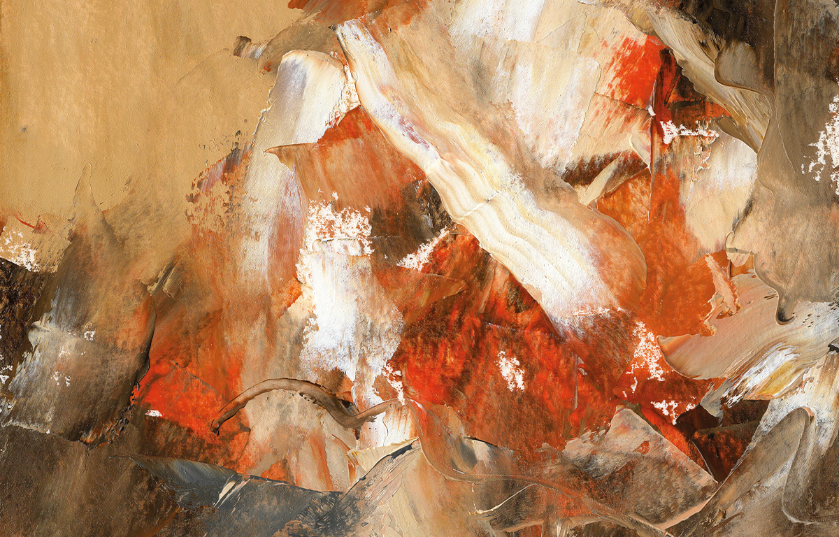
Orange and Clove
Pine and Snow
Chestnut and Smoke
Cranberry and Fir
Vanilla and Star Anise
Frost and Ember
Mulled Wine and Midnight
Snowdrop and Smoke
Cedar and Candlelight
Fig and Myrrh
Pear and Ginger
Ivy and Frost
Plum and Pinecone
Nutmeg and Cream
Frosted Berry and Birch
Cocoa and Peppermint
Holly and Honey
Mistletoe and Moonlight
Tinsel and Tangerine
The collection will arrange these pairings into four chapters which I plan to reveal soon.
It going to be fun and messy putting all the artworks together – I look forward to revealing my progress on my website and socials in the coming months.