”Working with Cate has been an absolute pleasure. She's professional through and through, incredibly precise and quickly reactive to changes needed, not to mention the patience of a saint. Would happily work with her again.
Chirene Campbell,Account Director, Hollyrood PR
About
Hollyrood PR, contacted me for design support for an Annual Report on behalf of their client, The Property Ombudsman.
I was recommended to Hollyrood PR by an existing contact who I’ve worked with in the past.
“I have strongly recommended you, given your brilliant design expertise and approach. I was particularly keen to involve you because of your expertise in designing complex, narrative-led reports for public-interest and not‑for‑profit organisations, and your ability to make dense, operational content feel warm, accessible and visually coherent.”
Although my client was seeking three design quotes from agencies as part of their selection process, I was keen to communicate the value of working with me and grateful for the recommendation.
Brief
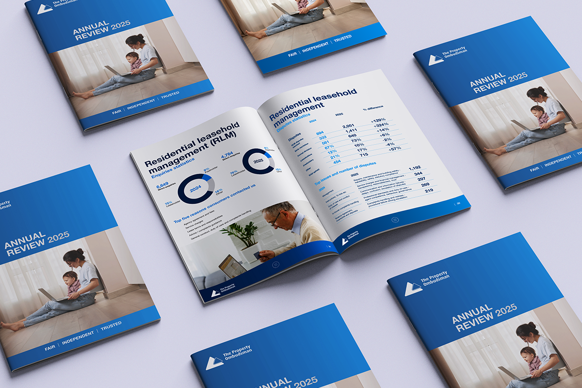
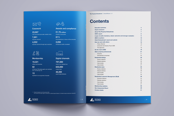
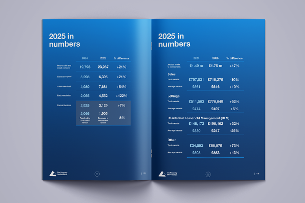
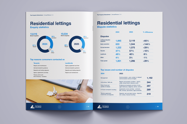
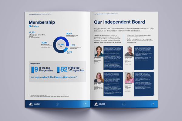
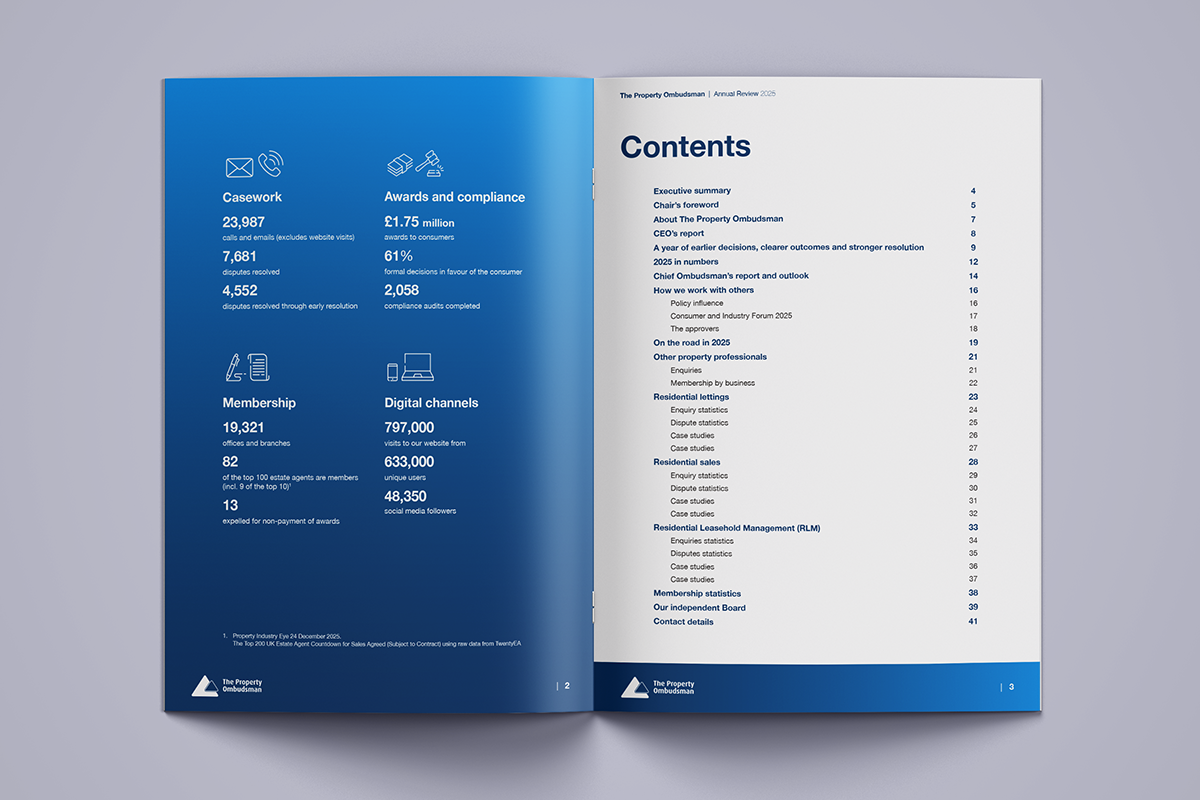
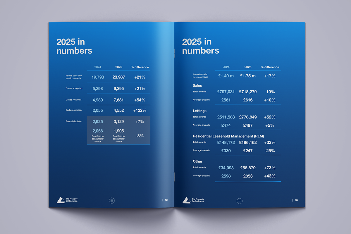
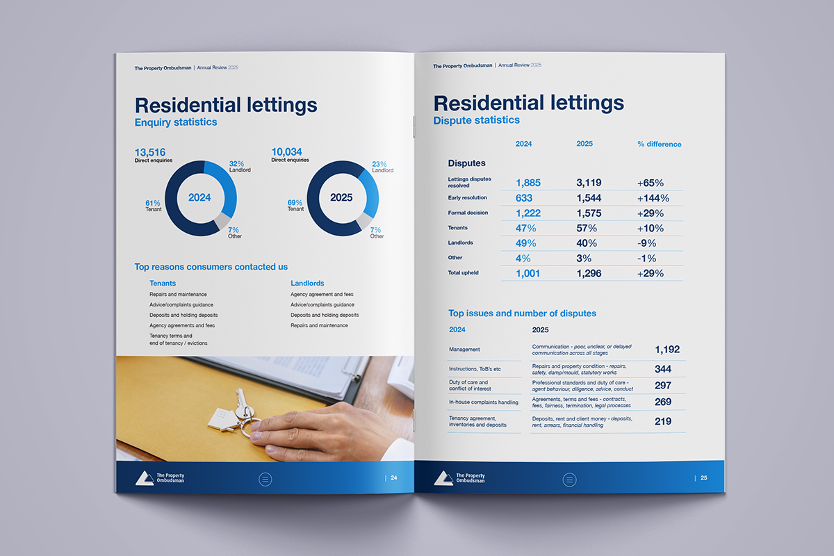
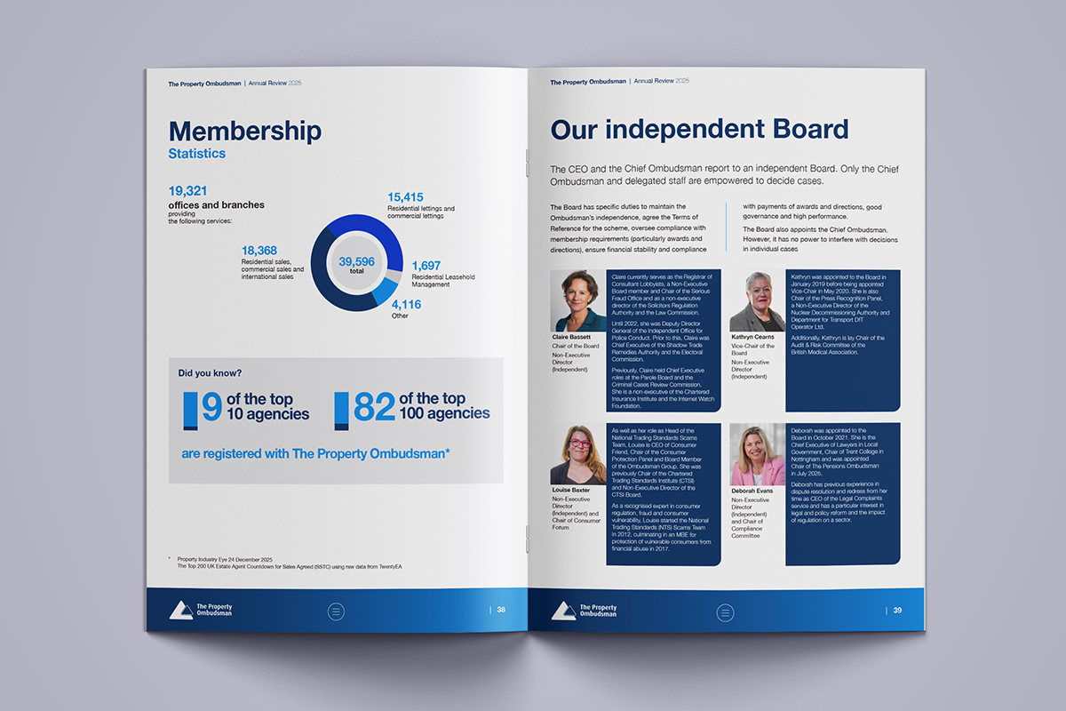
The document is designed to be a substantial, people-centred review that needs to balance strong narrative, data visualisation and governance requirements across 40–45 pages, including case stories, stats dashboards, infographics and photography-led sections.
Working with supplied brand guidelines, a slight refresh of the previous report is required.
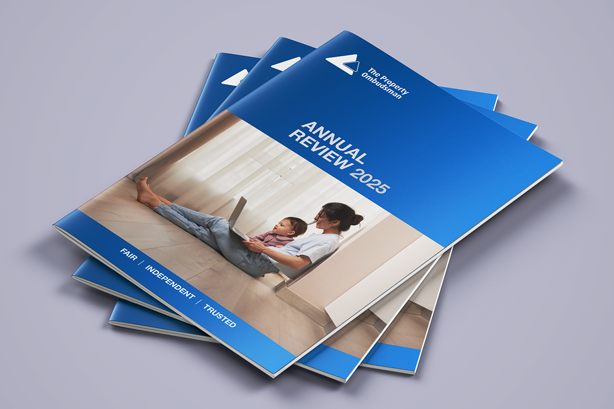
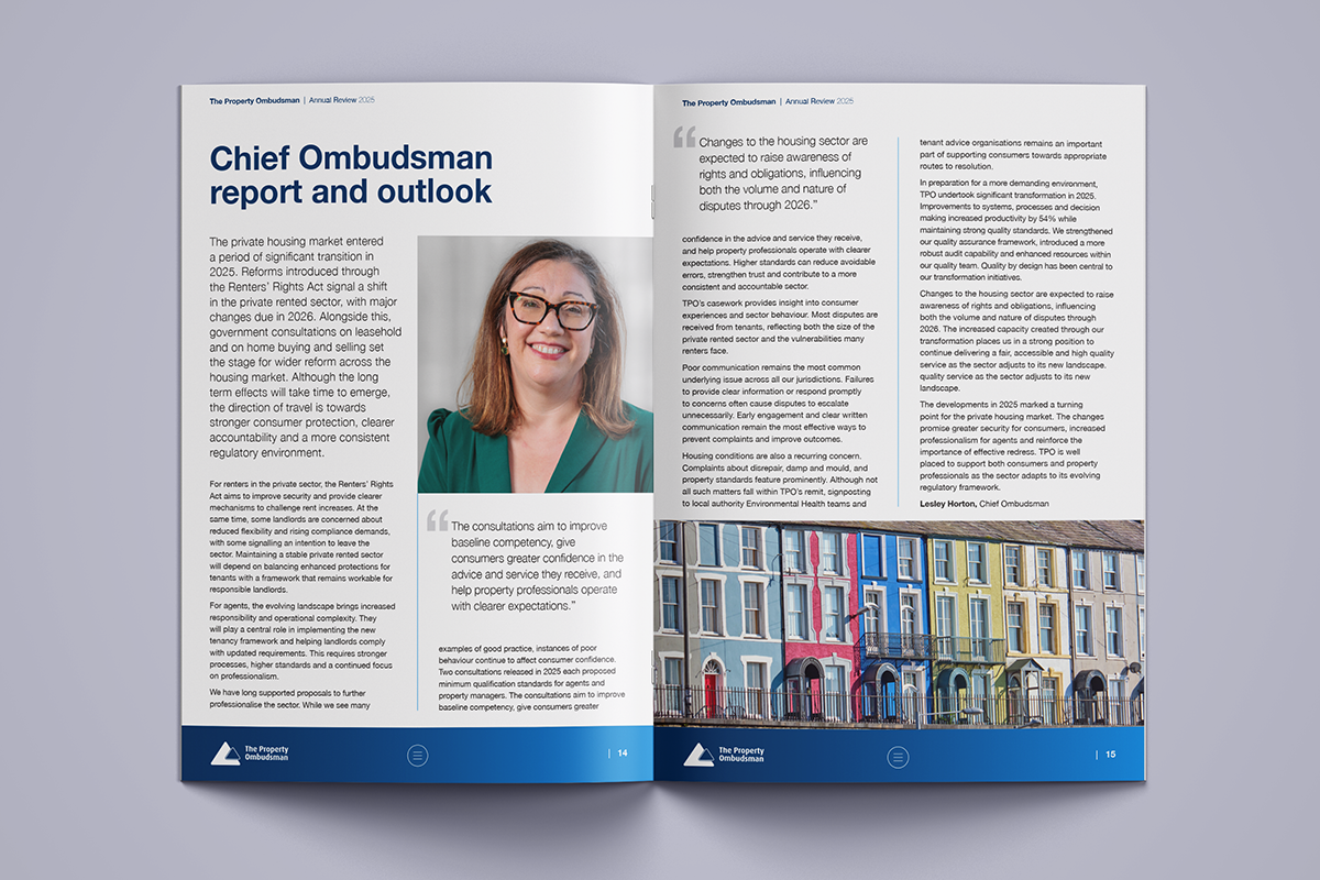
The client wishes to move away from the layout of previous landscape layout with a preference for a portrait format. The document should include a mix of full-bleed images, pull quotes, section openers and more technical, data-heavy spreads.
The Annual Report should be designed as a digital publication only.
Delivery
For a document this size, I like to work out an outline content plan, which gives me insight into the structure, flow and key visual moments.
Understanding that the client wanted to move away from the layout of previous landscape layout, I started my process by creating a selection of front cover and page designs in the new portrait format, following the brand guidelines supplied.
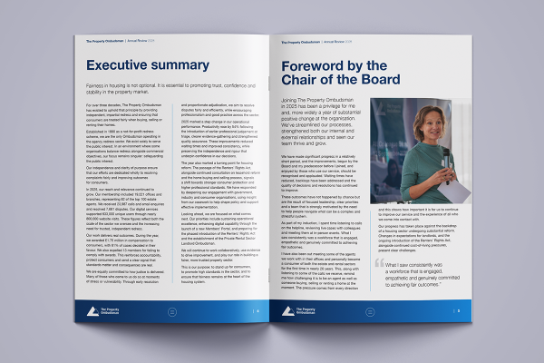
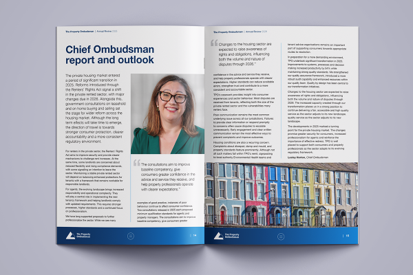
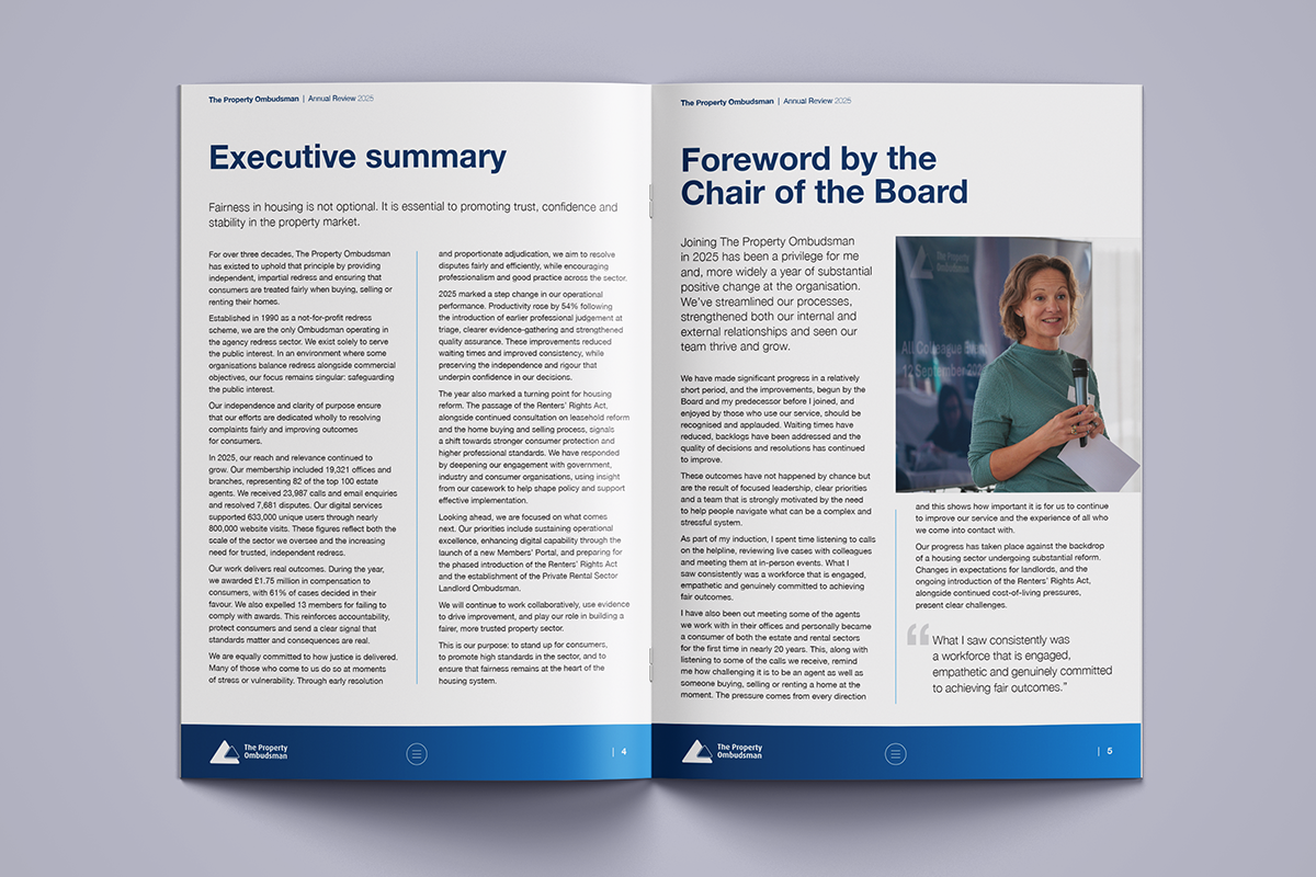
The design process includes setting up a page grid and making decisions regarding typography that flows naturally. I also moved away from the previous single column layout of text as it is difficult to read dense text across one column. Typesetting rules for visual readability includes setting text of up to 64 characters per line so the two column layout was created.
The introduction of pull out quotes to highlight key information not only helps to fill space but also aids the visual reader to scan the content easily. However when designing with accessibility in mind and for compliance of assisted technology, the pull out quotes are set as ‘artifacts’ as they are a distraction to users of screen readers.
In addition to designing for digital with accessibility in mind, I am also mindful of supplying a print version. In my experience my clients often asked for print files for small print runs. This isn’t always easy to supply quickly where a digital first format is requested. To mitigate this scenario, I prefer to design with both formats in mind to save extra time down the line.
Alongside all of this I have an experienced eye for ‘widows’, ‘orphans’, ‘runts’ and ‘rivers. These are specific typesetting terms that describe undesirable situations where the text doesn’t flow properly. These days digital typesetting enables this rule to be overlooked however these typesetting standards should still be in place for digital PDF’s.
To combat these situations, I use various methods to fix typography including tracking and slight column adjustments.